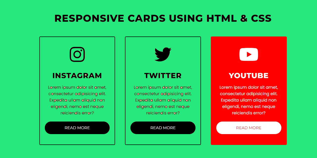
In today’s digital age, social media platforms have become a cornerstone for personal branding, marketing, and sharing ideas. Visual content plays a vital role in engaging audiences, making it important to design elements that are not only aesthetically pleasing but also functional and adaptable to different screen sizes. One such element is responsive social media card design. This article will explain how you can create an attractive and functional social media card using HTML and CSS.
What Is a Social Media Card Design?
A social media card is a concise, visually appealing element that represents content such as a blog post, advertisement or user profile. These cards improve the user experience by making information digestible at a glance. When they are made responsive, they seamlessly adapt to different devices, ensuring consistent functionality and design across desktops, tablets, and smartphones.
Responsive design is not only a trend but a necessity in an era where users interact with content on different devices. Making sure your social media responsive card design looks flawless on different screen sizes can boost user engagement and brand credibility.
Planning Your Design
Before diving into the code, consider the core components of a social media card:
- Header: Includes the user’s avatar, name, and possibly a timestamp.
- Content: Highlights the main message or shared content, such as text, images, or videos.
- Footer: Contains interactive elements like likes, comments, and share buttons.
A good social media card balances these components, focusing on a minimalist yet engaging layout.
A social media card design is a compact, visually appealing block of content that typically includes an image, title, description, and call-to-action (CTA). Its primary purpose is to deliver information in an eye-catching and accessible format, whether it’s a product advertisement, user profile, or post preview.
A responsive design ensures that the card adapts seamlessly to different screen sizes and devices, enhancing usability and user experience. With the rise of mobile browsing, responsiveness is not just a feature; it’s a necessity.
Steps to Create a Responsive Social Media Card Design
1. Plan the Card Layout
Before diving into coding, sketch the structure of your social media card. Typically, a card includes:
- A header (profile picture or logo with a name)
- An image or video section
- A text section (title and description)
- An interactive CTA button or icon set
This structure allows you to balance functionality and aesthetics.
2. Set Up the Basic HTML Structure
Your HTML document will act as the skeleton for the card. Focus on semantic HTML5 elements to ensure accessibility and better SEO performance. A typical structure might look like this:
3. Add Styles with CSS
CSS breathes life into your design. Begin by defining the card dimensions, font styles, colors, and spacing. Use modern CSS techniques like Flexbox or Grid for layout and responsiveness.
Key Focus Areas:
- Font Styling: Choose fonts and sizes that are legible and appealing.
- Colors: Align the design with your brand or theme using a balanced palette.
- Spacing: Use consistent padding and margins to avoid clutter.
4. Make It Responsive
Responsiveness ensures your social media card looks great on desktops, tablets, and smartphones. Achieve this using CSS media queries.
For instance:
- On larger screens, the card could display horizontally with sections side-by-side.
- On smaller devices, stack elements vertically for better usability.
Best Practices for Responsive Social Media Card Design
1. Optimize Images
Images are a crucial part of any social media card. Use responsive image techniques like the srcset attribute or CSS properties to ensure images adapt to screen resolutions without sacrificing quality. Compress images to reduce loading times, especially for mobile users.
2. Use Flexbox and Grid for Layout
CSS Flexbox and Grid are modern solutions for creating adaptive layouts. They allow you to control alignment, spacing, and wrapping effortlessly. For example:
- Use Flexbox for vertically or horizontally aligning elements within the card.
- Apply Grid for more complex layouts, such as aligning text alongside images.
3. Prioritize Mobile-First Design
With mobile users comprising a significant share of web traffic, designing for smaller screens first ensures a seamless experience. Use media queries to progressively enhance the design for larger screens.
4. Incorporate Hover and Click Effects
Enhance interactivity by adding hover effects for desktop users. For instance, a subtle shadow or scaling effect can make the card feel dynamic and engaging.
5. Ensure Accessibility
Accessibility ensures your design is usable by people with disabilities. Use proper semantic HTML, and include alt text for images. Pay attention to color contrast ratios and test your design using tools like Lighthouse or Axe.
Why a Responsive Social Media Card Design Matters
In a crowded digital space, grabbing and retaining user attention is a challenge. A responsive social media card design:
- Improves Engagement: A well-designed card encourages users to interact with your content.
- Enhances User Experience: Responsive cards ensure that all users, regardless of device, have a seamless browsing experience.
- Boosts Conversion Rates: By including intuitive CTAs, you can guide users toward specific actions, such as making a purchase or sharing content.
Tools and Frameworks to Simplify Your Design
If coding from scratch seems daunting, several tools and frameworks can speed up the process:
- Bootstrap: A popular CSS framework with pre-designed components, including cards.
- Tailwind CSS: A utility-first CSS framework for rapidly building custom designs.
- Figma or Adobe XD: For prototyping and visualizing your design before coding.
Final Thoughts
Creating a responsive social media card design using HTML and CSS requires a balance of creativity, technical skill, and user-centric thinking. By focusing on simplicity, accessibility, and responsiveness, you can craft a design that not only looks good but also delivers value to your users.
Whether you’re building cards for a personal project, a business website, or a social media platform, the principles discussed here will help you create a design that stands out in a competitive digital landscape.


